Picker views are a fundamental component in iOS applications when you need to present a selection of items in a spin-wheel fashion. It’s commonly used for choosing items like date components, custom textual data, numbers, and more. In this tutorial, we’ll learn how to implement and use the picker view in an iOS application.
Steps to Implement a Picker View
The picker view exhibits a slot-machine-like interface, showcasing sets of values. Users can make selections by spinning the wheels, aligning their chosen value with a selection indicator. The picker view’s user interface is organized into components and rows. Each component functions as a spinning wheel, housing rows at particular index positions. This guide has been meticulously created using Xcode 10 and is tailored for iOS 12.
Setting up the Project:
- Launch Xcode and initiate a new project by selecting “Single View App.”;
- For the product name, enter “iOSPickerTutorial,” and provide your standard values for Organization Name and Organization Identifier;
- Set the language to Swift, and proceed by clicking “Next.”
Setting Up the Storyboard:
- Navigate to the Storyboard;
- Add a Picker View to the main view;
- Click on the “Resolve Auto Layout Issues” button, and choose “Reset to Suggested Constraints.”;
- Access the Assistant Editor and ensure that the ViewController.swift file is in view;
- Create an Outlet by Ctrl-dragging or right-click-dragging from the Picker View to the ViewController class, and define it as follows.
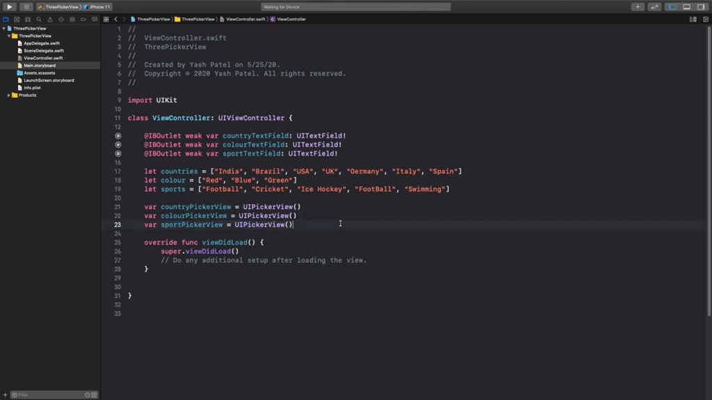
Coding
- Navigate to the ViewController.swift file;
- Ensure that the Picker View conforms to both the UIPickerViewDataSource and UIPickerViewDelegate protocols;
- Modify the class declaration line to the following:
class ViewController: UIViewController, UIPickerViewDelegate, UIPickerViewDataSource {
Change the viewDidLoad method to

override func viewDidLoad() {
    super.viewDidLoad()

    pickerView.delegate = self
    pickerView.dataSource = self
}
To supply values to the Picker View, include the following array within the ViewController class:
let colors = ["Red","Yellow","Green","Blue"]The `colors` array serves as the data source for our Picker View. To conform to the `UIViewDataSource` protocol, we need to provide delegate methods specifying the number of components and rows in the picker. Please implement these methods.
func numberOfComponents(in pickerView: UIPickerView) -> Int {
    return 1
}

func pickerView(_ pickerView: UIPickerView, numberOfRowsInComponent component: Int) -> Int {
    return colors.count
}
We define one component with the number of rows equal to the number of array items. Next, we assign the data in our array to the corresponding row.
func pickerView(_ pickerView: UIPickerView, titleForRow row: Int, forComponent component: Int) -> String? {
    return colors[row]
}
Project Deployment:
- Compile and launch the project;
- You’ll be able to choose various colors from the Picker View.
For the complete source code of the iOSPickerTutorial, please visit the ioscreator repository on GitHub.
Conclusion
The UIPickerView provides a convenient way to present selectable items in iOS applications. While this tutorial covered the basics, the UIPickerView is quite versatile and can be customized in many ways to fit the needs of your application. Remember to always consider the user experience when deciding where and how to use pickers in your app.
Considering your interest in iOS design elements, you may also like our tutorial on SwiftUI background coloring. It offers insights into another crucial aspect of app development, ensuring that your user interface is both attractive and functional.